Top Tips To Make Website User Friendly
How To Make Website User Friendly ?
Making a site user friendly that means your site should follow many factors such as navigation option, design and many more. Although it sound so easy to make user friendly site but it is difficult to create. But it is not impossible. Only you need to keep some tips in your mind while making of website.
Make A Menu For Easy To Follow
Main menu is the place from where we can access all the important information.
Add Drop Down Menus
Drop down menus are easily accessible by visitors. Visitors can easily go to their desired option.
Search Bar
Search bar is must option that you should provide on your site for faster navigation.
Avoid Abbreviations
Do not confuse your customers by putting abbreviation in menus. Use normal words to help them better.
Make Different And Small Categories
You are showing some products and service on your site then categorize them properly into small one.
Make easy navigation to follow
Visitors can get frustrated if they did not find any navigation option, by this they may leave the site or can close it. Why we are making website? Because we want more and more visitors to be on our site to get conversions, so better navigation means visitors will never leave the site and will be at the desired page and product without any frustration. Some key point comes under this as…
Be Assure That Your Links Work
If your site has broken links it may frustrate your customers. Fix your broken links to make it user friendly.
Logo
Create your logo and put it in the left corner. So that customers can have your name and content they are seeing. Logo should directly link to the home page to return on it from any page instantly.
Add Pictures And Images In Content
By the help of pictures and images, we can better explain about our content. Pictures are visual content, able to describe about relative products, services etc.
Why Always Long Paragraph?
Long paragraph is not always needed if so then go for it otherwise write precise description.
Use Dynamic Design To Promote More And More
Use this when you want to show off your best items all at once.
Add Contact
The more information you give, the more conversion you can have. For this, contact numbers are important. If you have phone number of someone then it will be convenient for you to approach them. So put your contact number on an obvious place at your site to find it easily.
Include Social Media Icons
It is good to be on social media sites to promote business. If you have social media account then add them to your site for linking with customers. Visitors will love to contact you on social sites with less formal environment and you can update them with new specials via social channels.
Make content more readable
Clearly written content is more likely to be read by readers than hefty one. If you write concise, visitor’s readability will increase and my suggestion is to use bulleted points to express content point to point. No need to write heavy language, go for easy and understandable language.
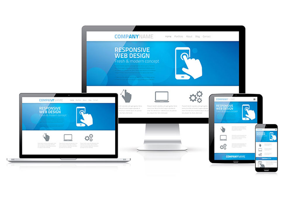
Make your site responsive
Make your site responsive that means your site will be accessible by mobile, tablet or desktop and laptop. Responsive site gives complete errorless online experience with any one of described device.
Main benefit of a site to be responsive is it will be platform independent. Nowadays people are more on mobile rather than desktop they cannot even spend one hour without it so going into mobile is quit advantageous.
Highlight, boldface or under line keywords
Bold option is the splendid feature if you want to draw attention of user. Bolding keywords help them and tell them regarding what is important in your content. Links should appear different to have attention on it and it should open in a new window so visitors have navigation and with this navigation, they will never move away from your site.


